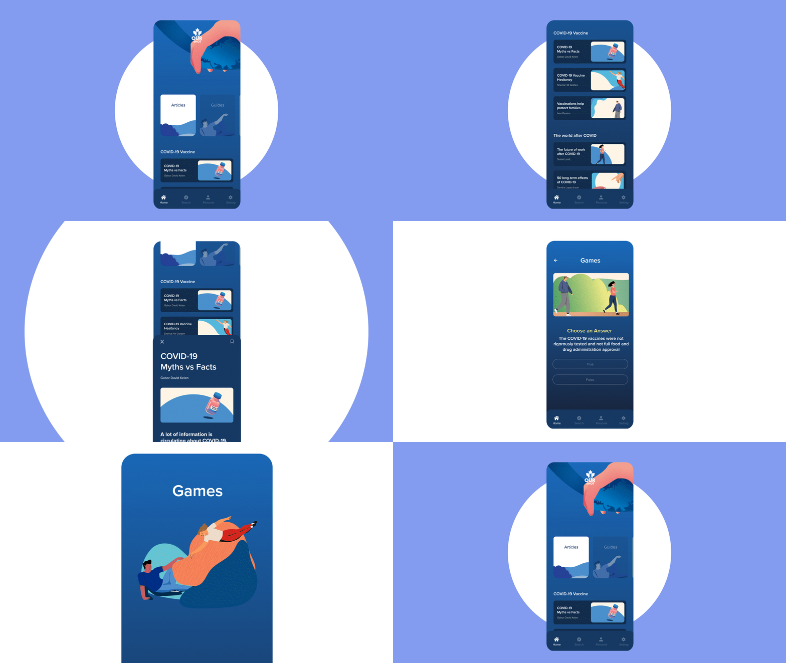
Get the Facts, Get Vaccinated
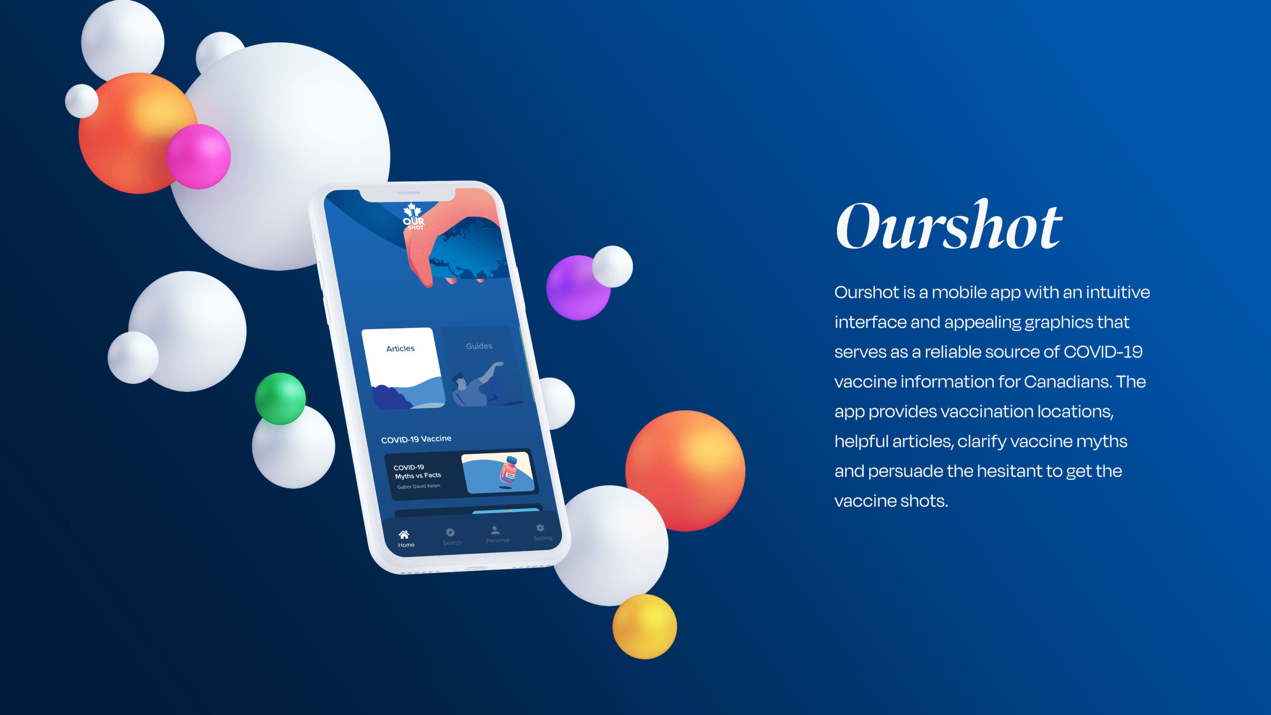
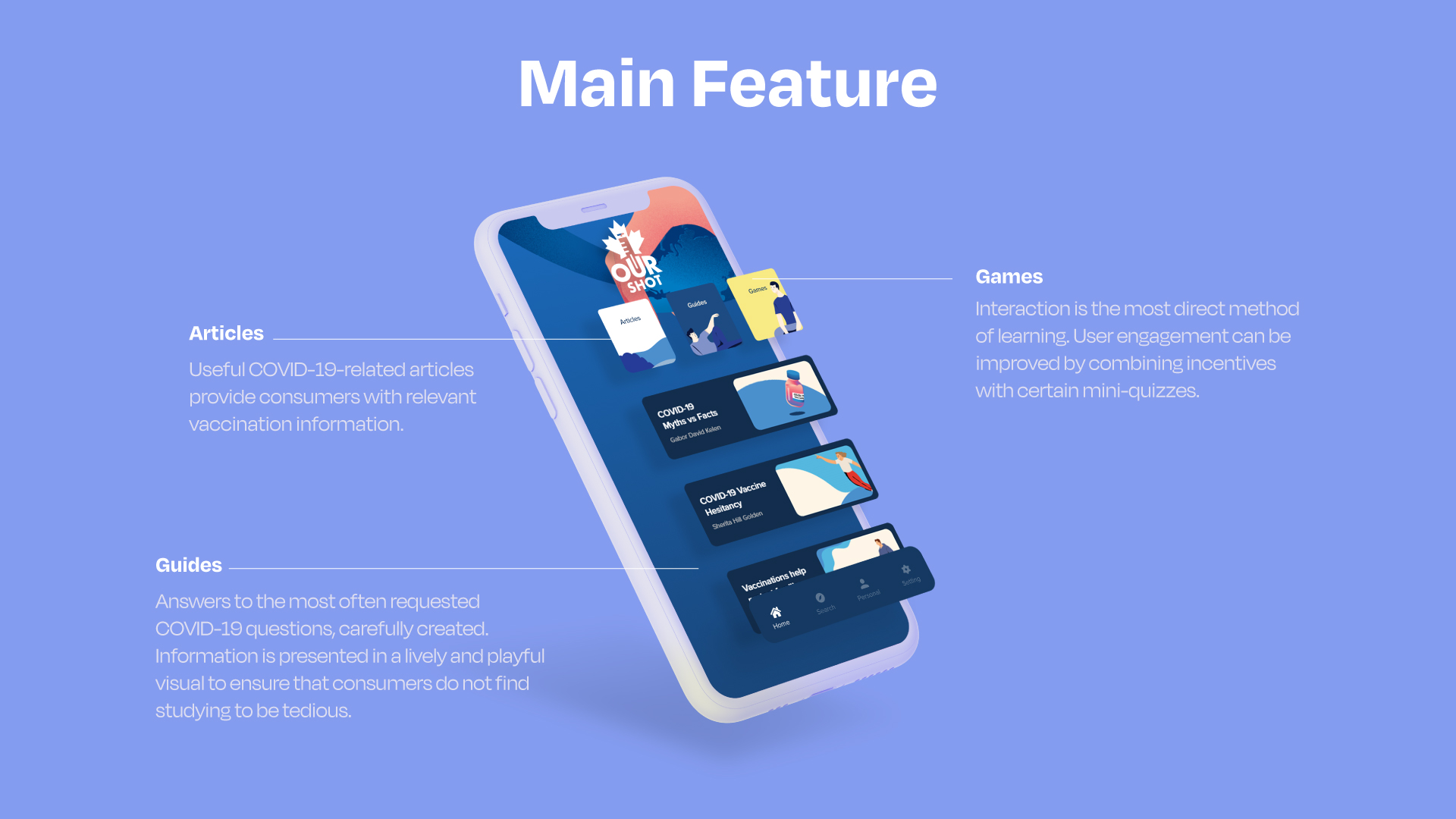
Ourshot is a sleek and user-friendly mobile app designed to provide Canadians with reliable COVID-19 vaccine information. Featuring an intuitive interface and engaging visuals, the app offers vaccination locations, myth-busting resources, and informative articles to support informed decisions and encourage vaccine confidence
UX Process
Research ⟶ User Persona ⟶ User Flow ⟶ Wireframe ⟶ UI Design
Research
Problem
Many COVID-19 vaccine holdouts claim to be concerned about the safety and adverse effects. There are also practical problems, such as the fact that some people are afraid of needles or have severe allergies to vaccination components. Those with higher vaccine resistance or hesitancy are more likely to have a set of strongly held beliefs, a lack of trust in those responsible for health.
Misinformation regarding the COVID-19 vaccination is everywhere on social media. Furthermore, the majority of vaccine acknowledgment sources are tedious and difficult to access.
Idea & Goals
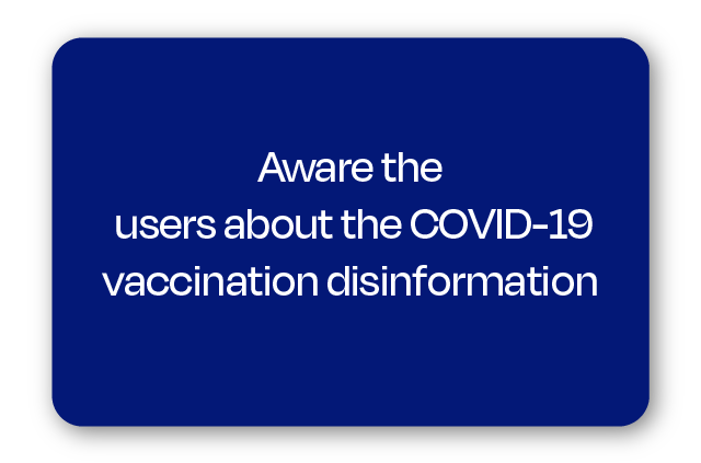
The Ourshot mobile app is considered to be successful when it accomplishes these three goals:


Insights
Real-world interviews and surveys assist me understand the frustrations and aims of my consumers. There are some COVID-19 Vaccine mobile applications, according to my research. However, the majority of the applications appear to be boring and difficult to connect with people. They all share the same problem: a lack of visual features, which are crucial in drawing viewers.
User Persona
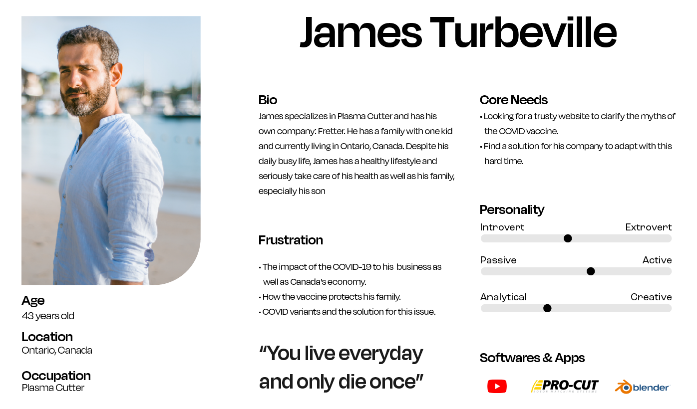
James is interested in learning more about the COVID-19 vaccine after hearing several lies about it from his pals. To learn the knowledge, he seeks out a reliable source.
User Jouney Map
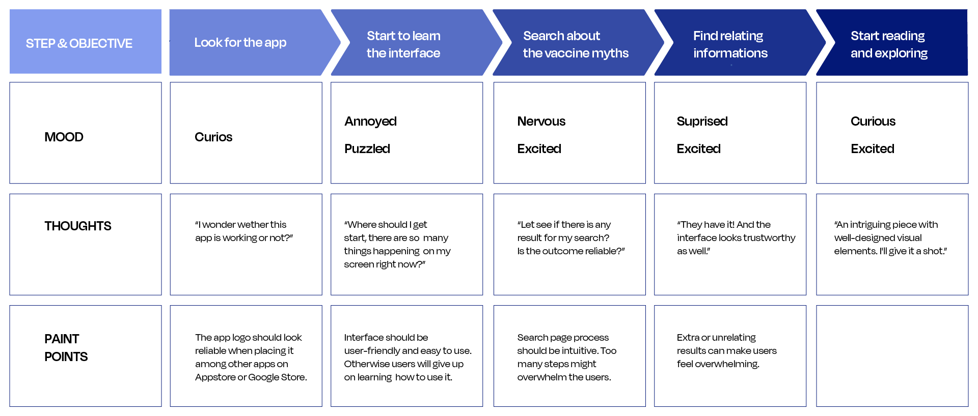
The user journey map highlighted how beneficial it would be in terms of developing a quick and easy manner for users to access the provided functionalities.
User Flow
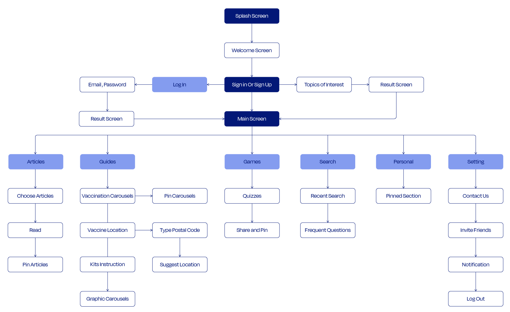
Because Ourshot is an instructional app with four separate functions, it's critical that everything is presented in a clear and easy-to-understand manner. By making the user flow intuitive, I hope to prevent creating an overpowering experience for them.
Wireframe
User Interface Design
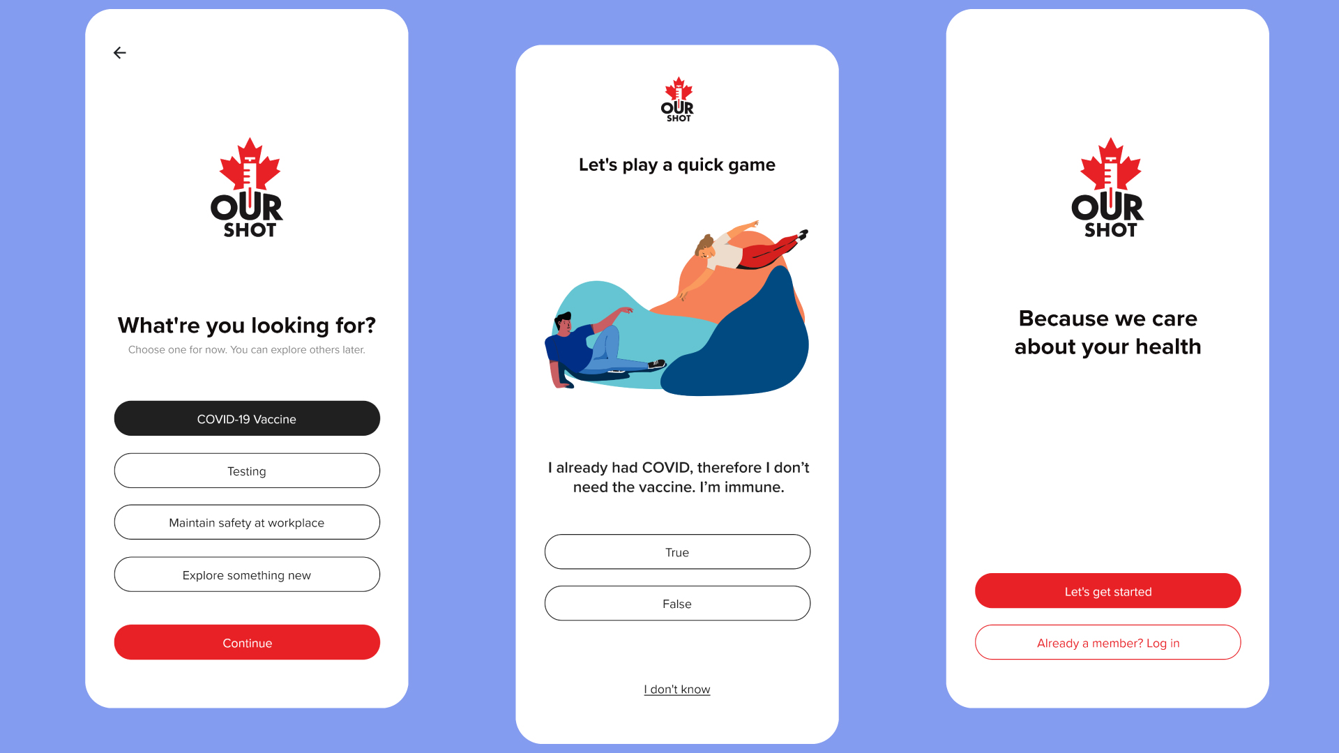
On boarding
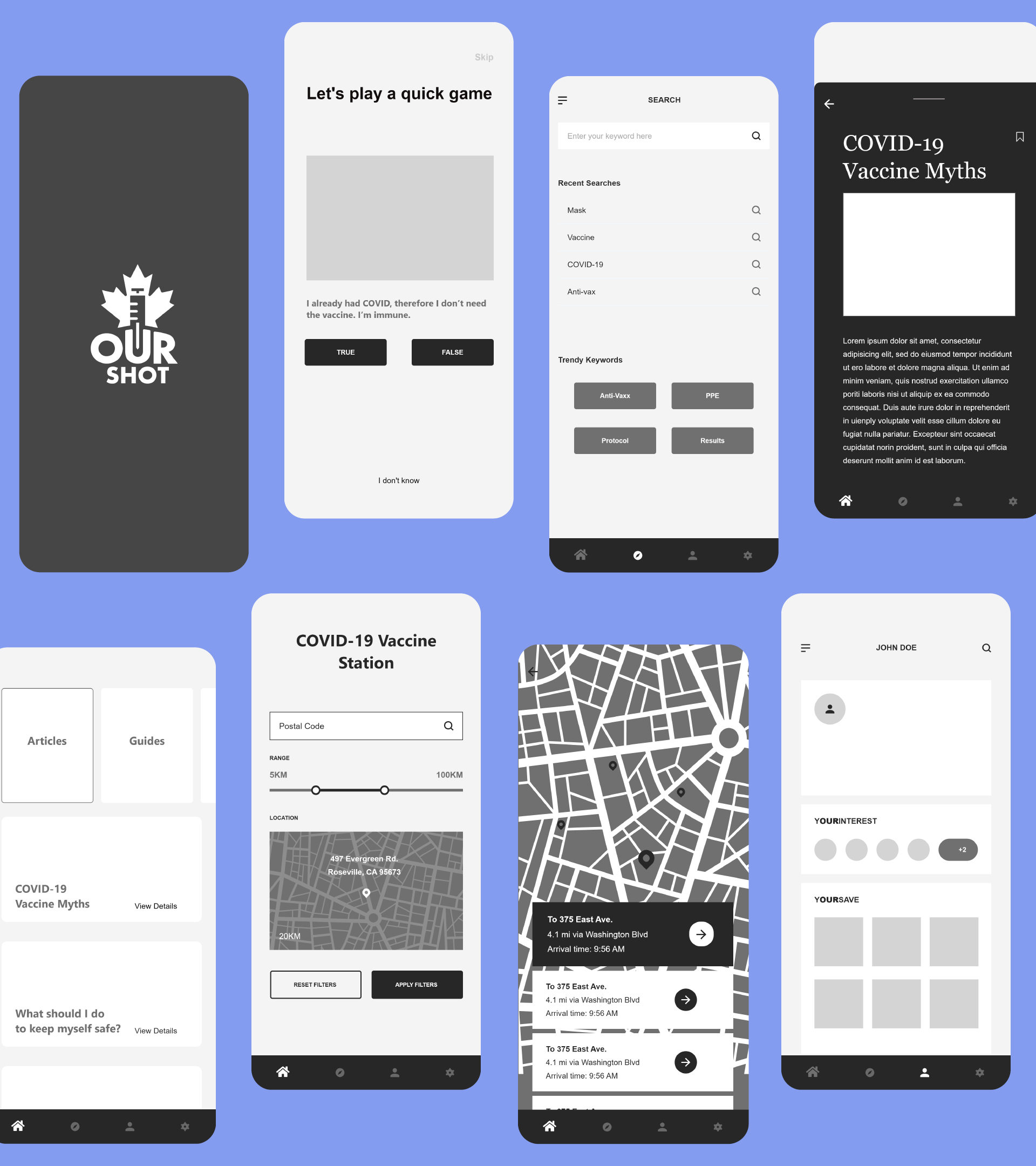
Because the initial impression determines whether or not the user continues to use the product, the onboarding protocol should be fast but efficient. Because this is a complex app, I'd want to provide the customer with a simple and quick sign-up procedure that is tailored to their preferences.
Guides
Although the aesthetic aspect is vital in "Ourshot," the most critical component in determining the app's success is information. As a result, finding a sweet spot to balance between delivering aesthetic components while still displaying information vividly and making them stand out among images is crucial.
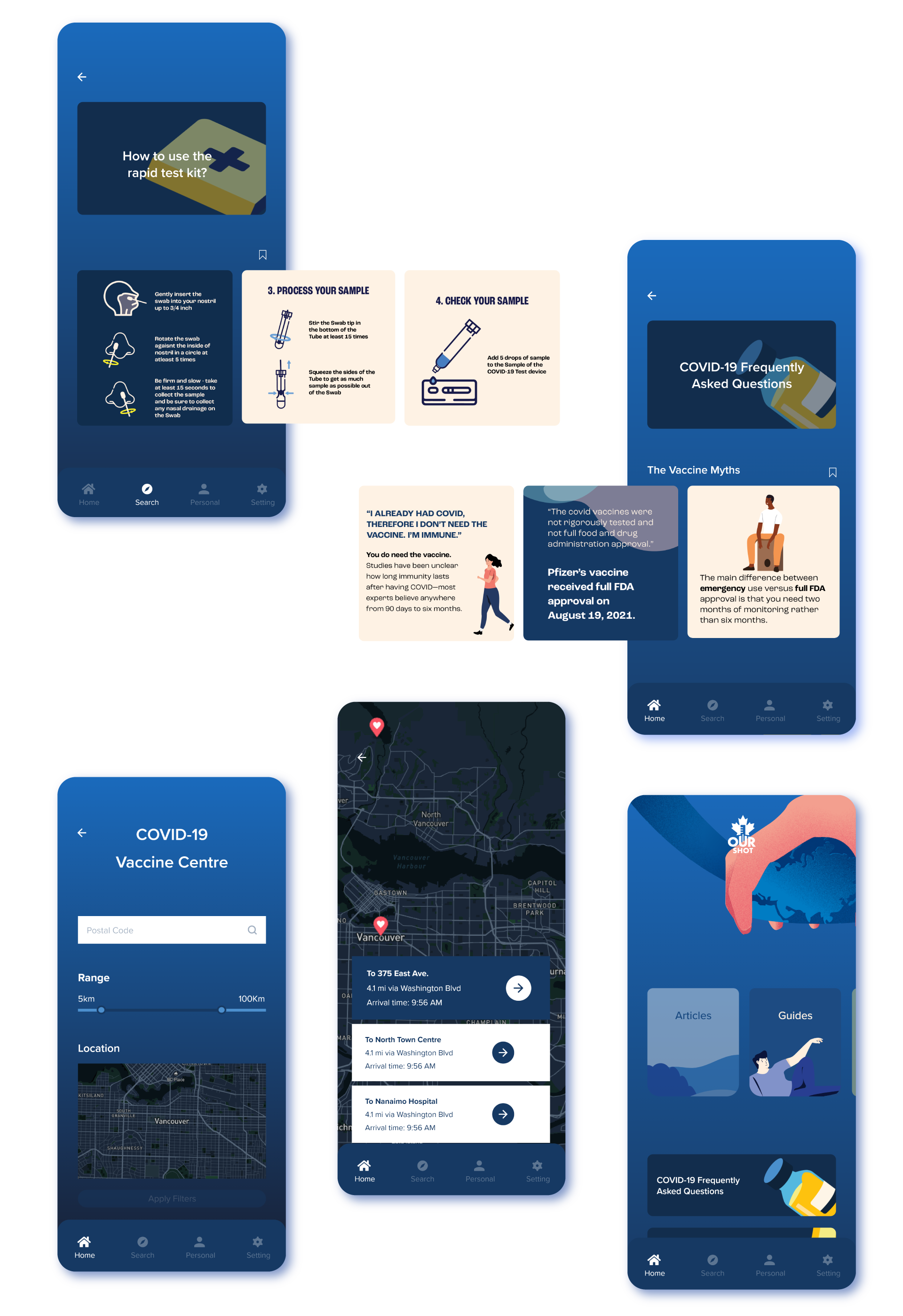
Articles & Games
Illustrations are regarded to be moderately utilized in order to maintain user interest. To ensure consistency, images are reused as both an internal and external component, decreasing the need for users to rethink. When there is a need to convey a large quantity of information on the screen at the same time, animation is an important feature to use.
Let’s brew something bold—coffee’s on meっ♨
@2026
Read.cv