Monster Energy
A refreshing appearance for Monster Energy Drink
SCOPE OF WORK:
Package Design, Branding
TOOLS:
Adobe Illustrator, Adobe Photoshop
Challenge
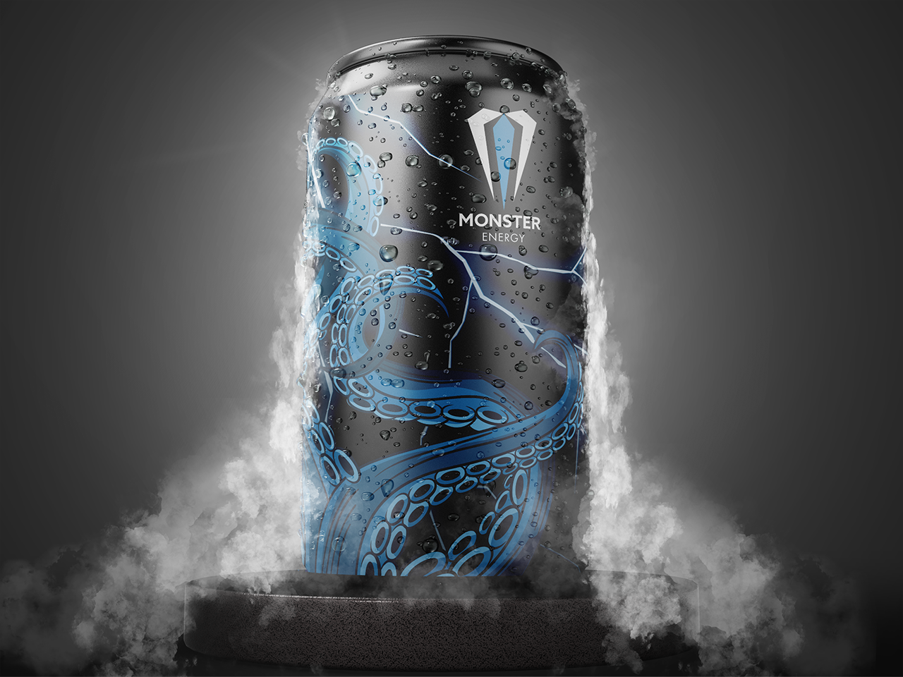
After years of claims that it caused fatalities and injuries, Monster Energy company rebranded as beverages to avoid regulation in 2013. The idea is to make the packaging more approachable to new consumers while still retaining Monster Energy's iconic sign, which has remained with loyal customers for years.
Approach
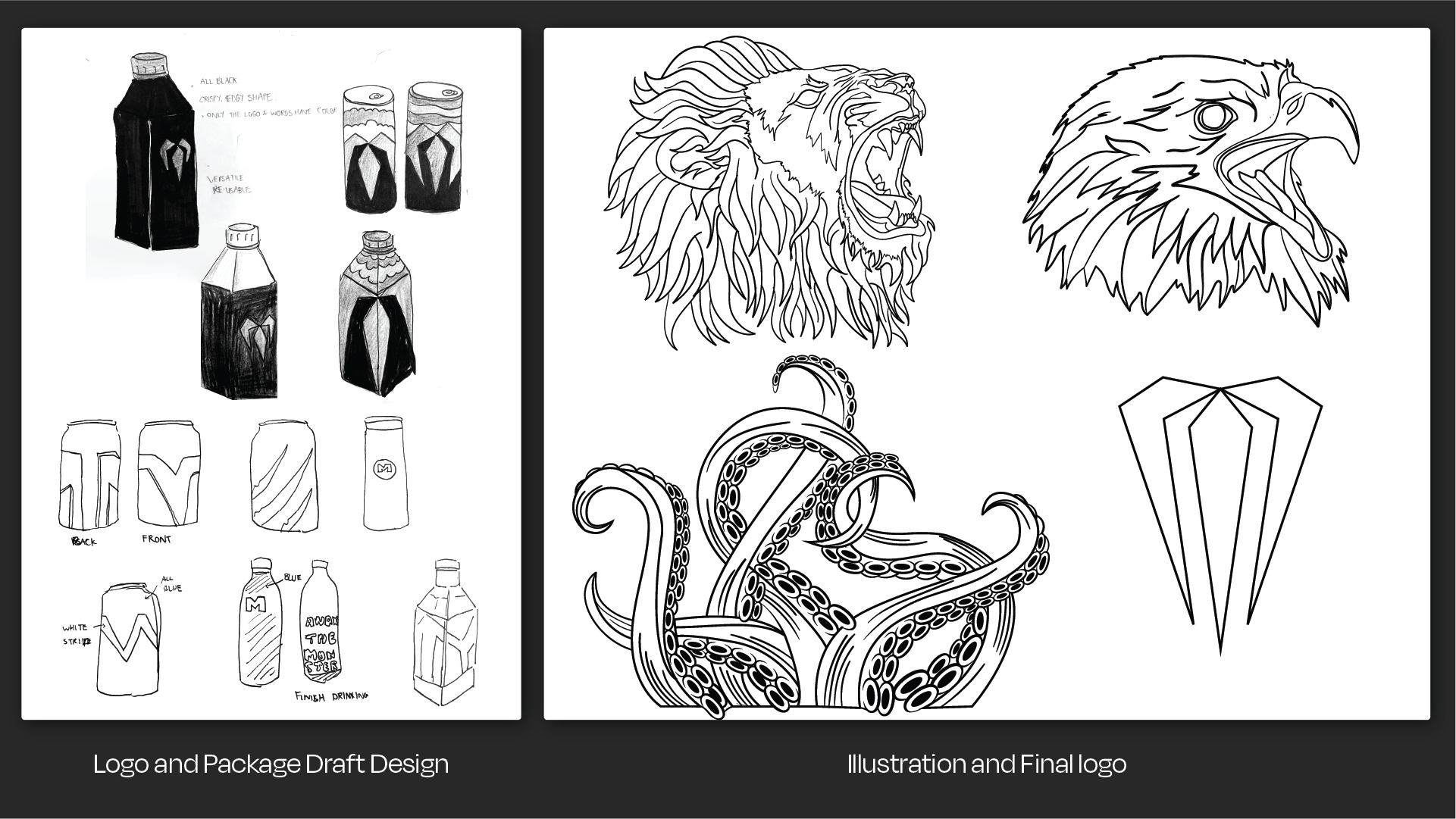
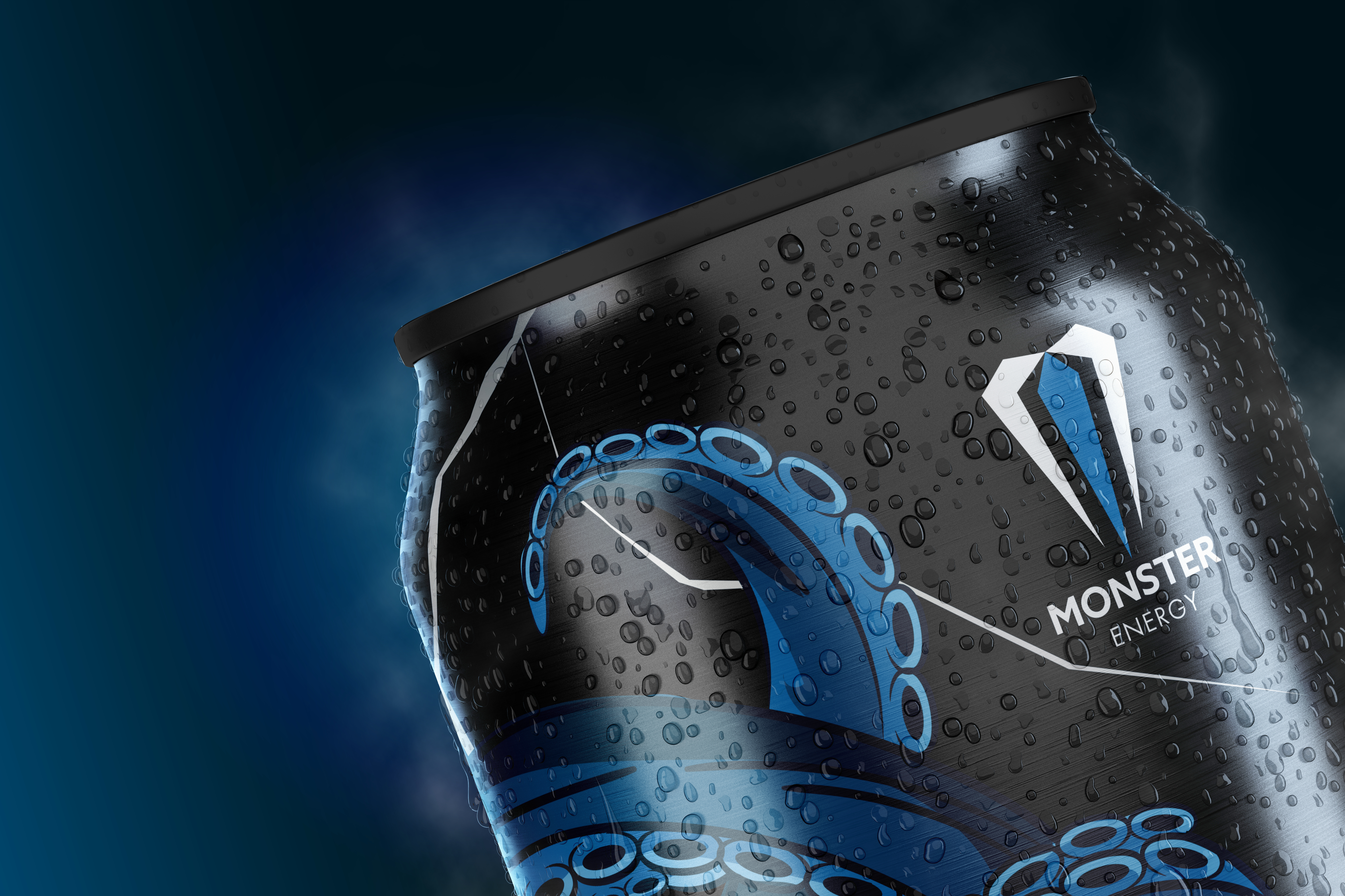
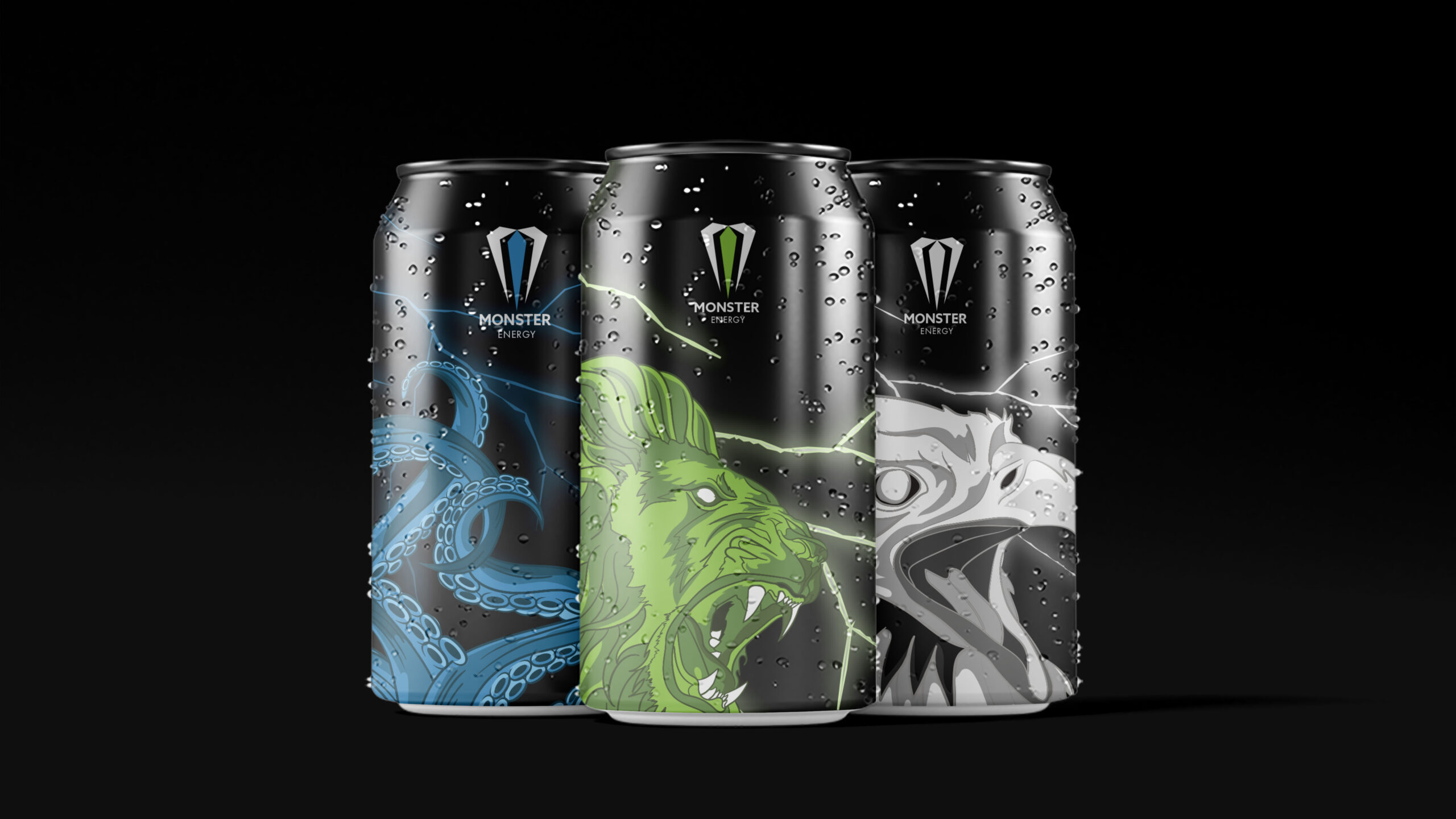
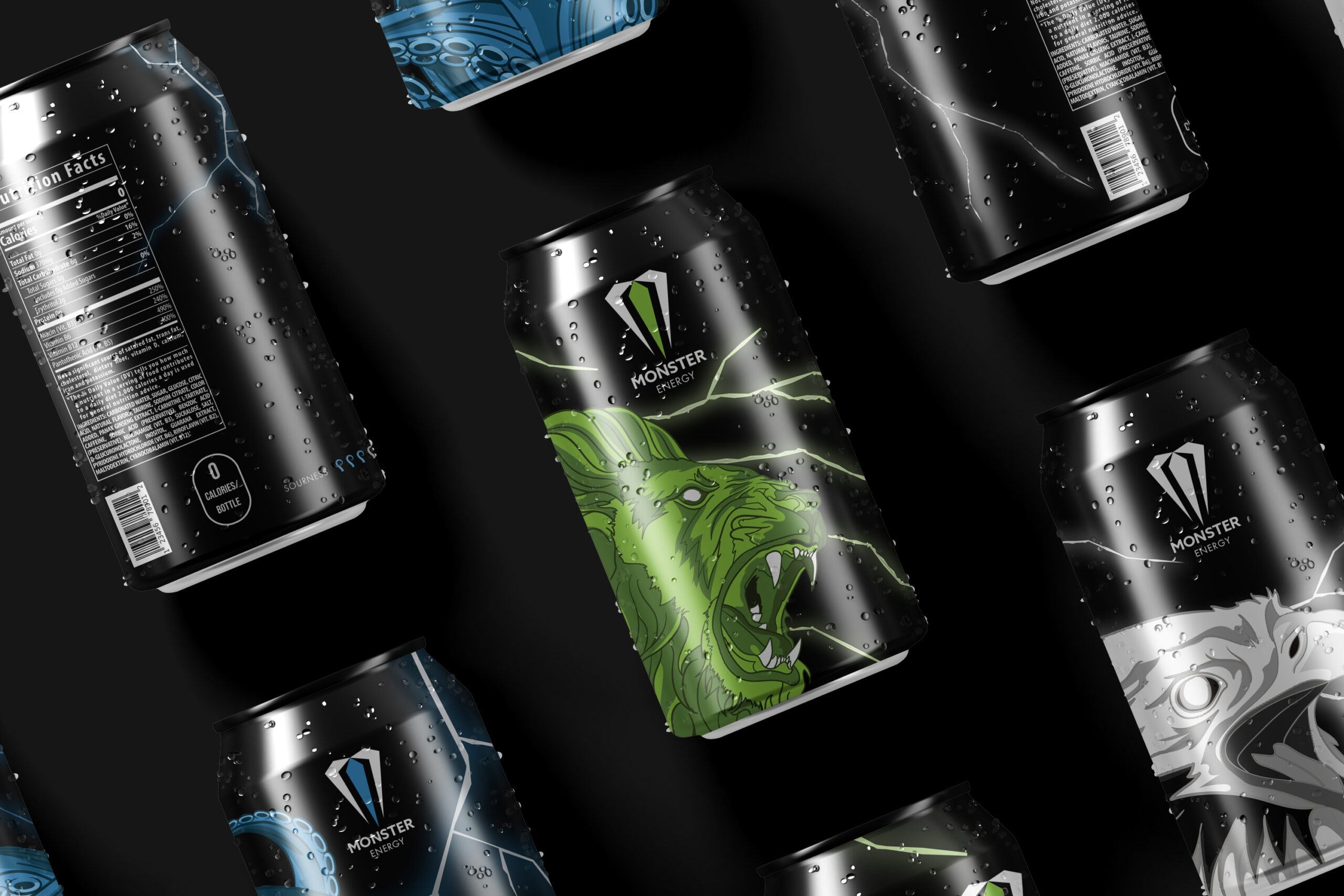
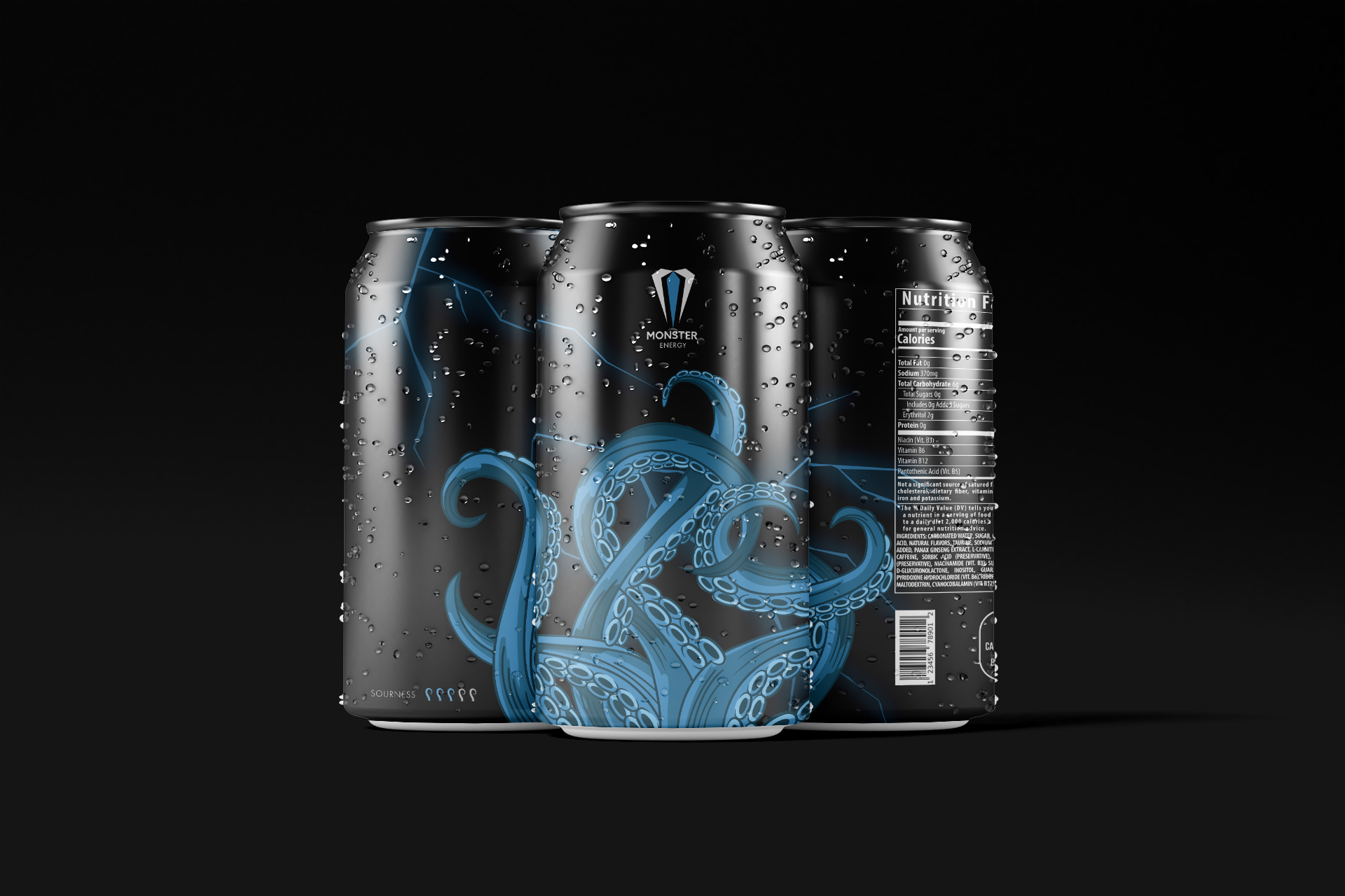
A logo redesign is needed for the beverage to have a less intense image and appeal to a wider range of customers. All embossed textures should be removed. Additionally, effectively utilized the mythical creatures to give a unique character to each flavor, as well as lightly add the thunder texture to the backdrop. By doing so, the "spirit" of Monster Energy can still be maintained with a powerful visual while also attracting enough customer attention when placed on the shelves.
Let’s brew something bold—coffee’s on meっ♨
@2025
Read.cv