Fairway Market
Embrace Asian Culture
Project Info
Role: Graphic Designer
Status: Complete
Year: 2021
Deliverables
Competitive Analysis
User Research
Brand Identity

Background
Fairway Market is one of Vancouver Island’s largest independently owned grocery stores with 10 locations in British Columbia, Canada and has existed since 1963. With the rise of other Asian Food Distributors in the area such as T&T Market, Fairway wants to rebrand and freshen itself in order to appeal to a newer generation of clients while still maintaining its distinct identity.
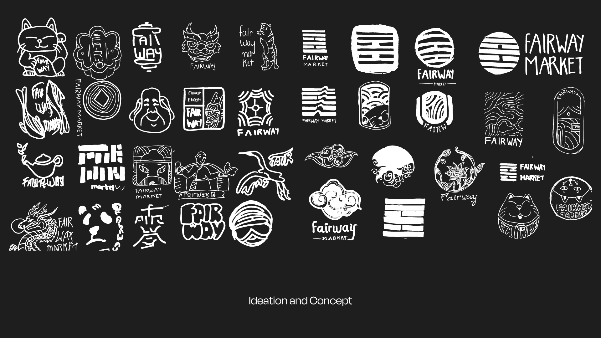
Challenge
The current logo has been familiar to consumers for more than ten years. Unfortunately, it also convinces locals that Fairway is just a regular brand in comparison to its competitors. Fairway's target audience is the younger age, thus the brand must have a more modern and approachable appearance.
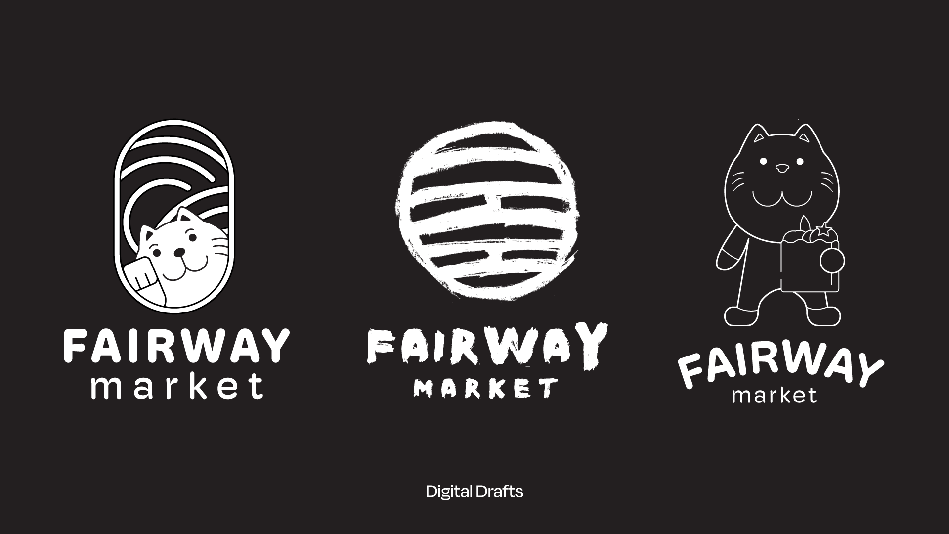
Approach
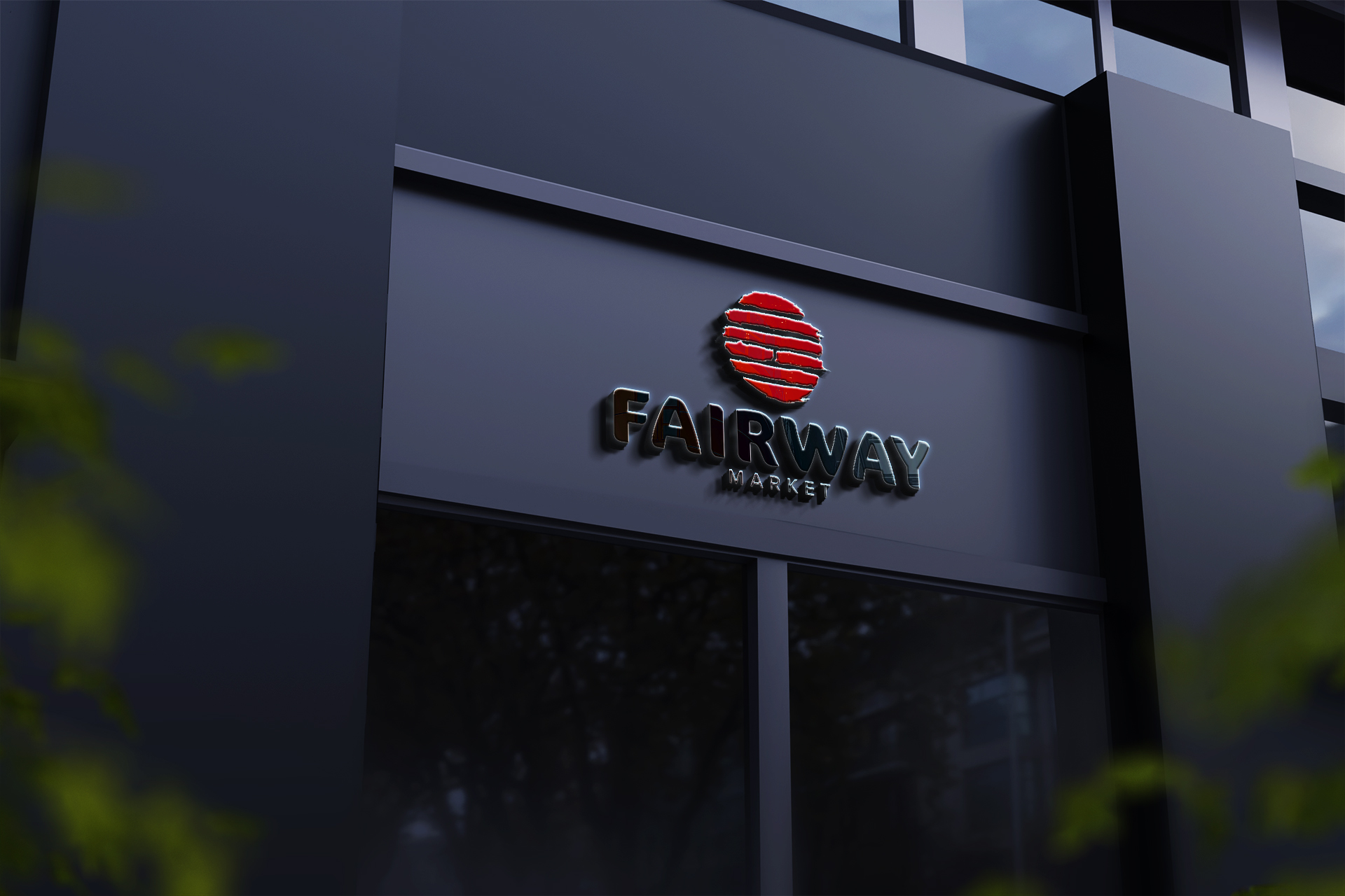
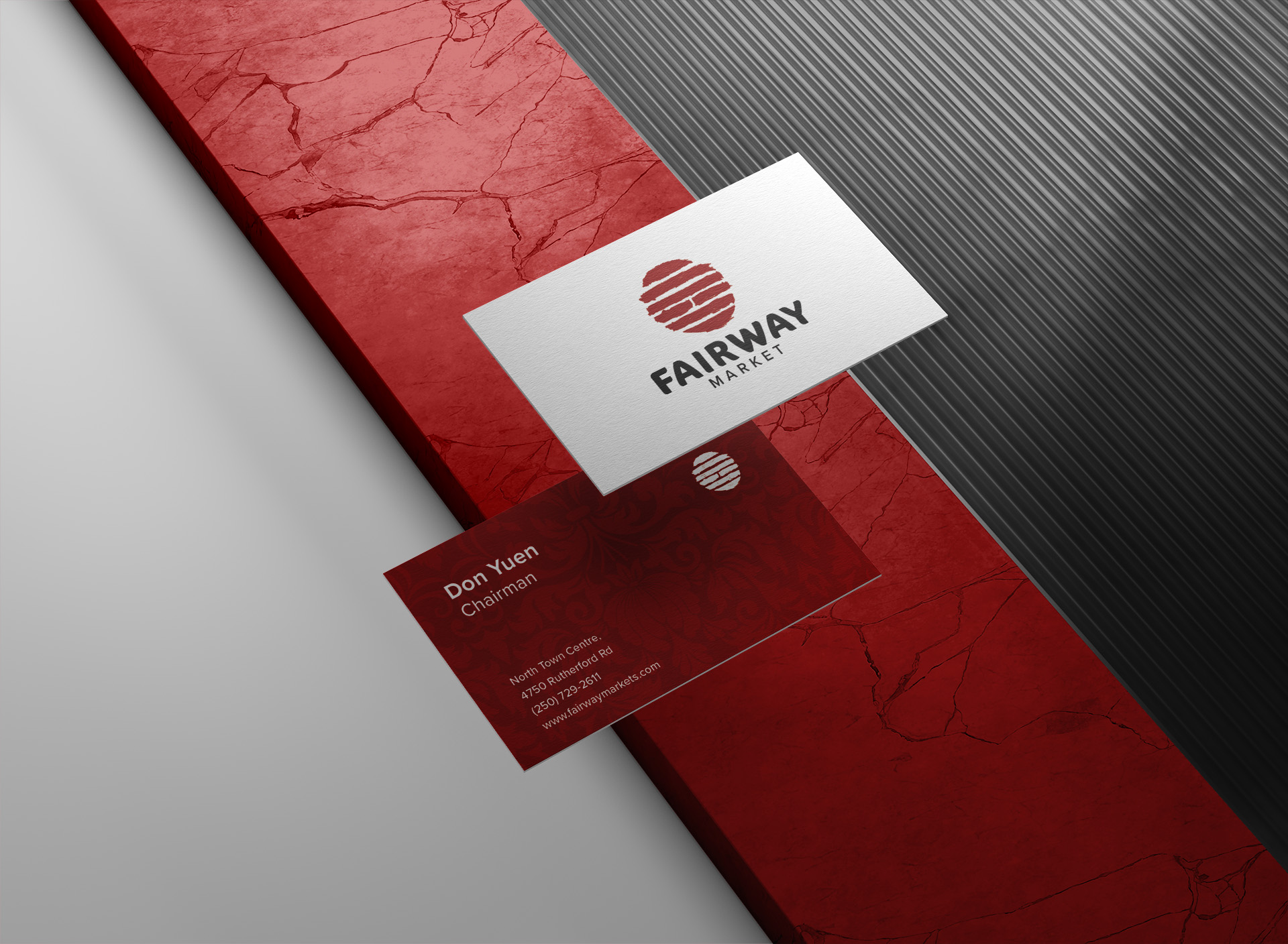
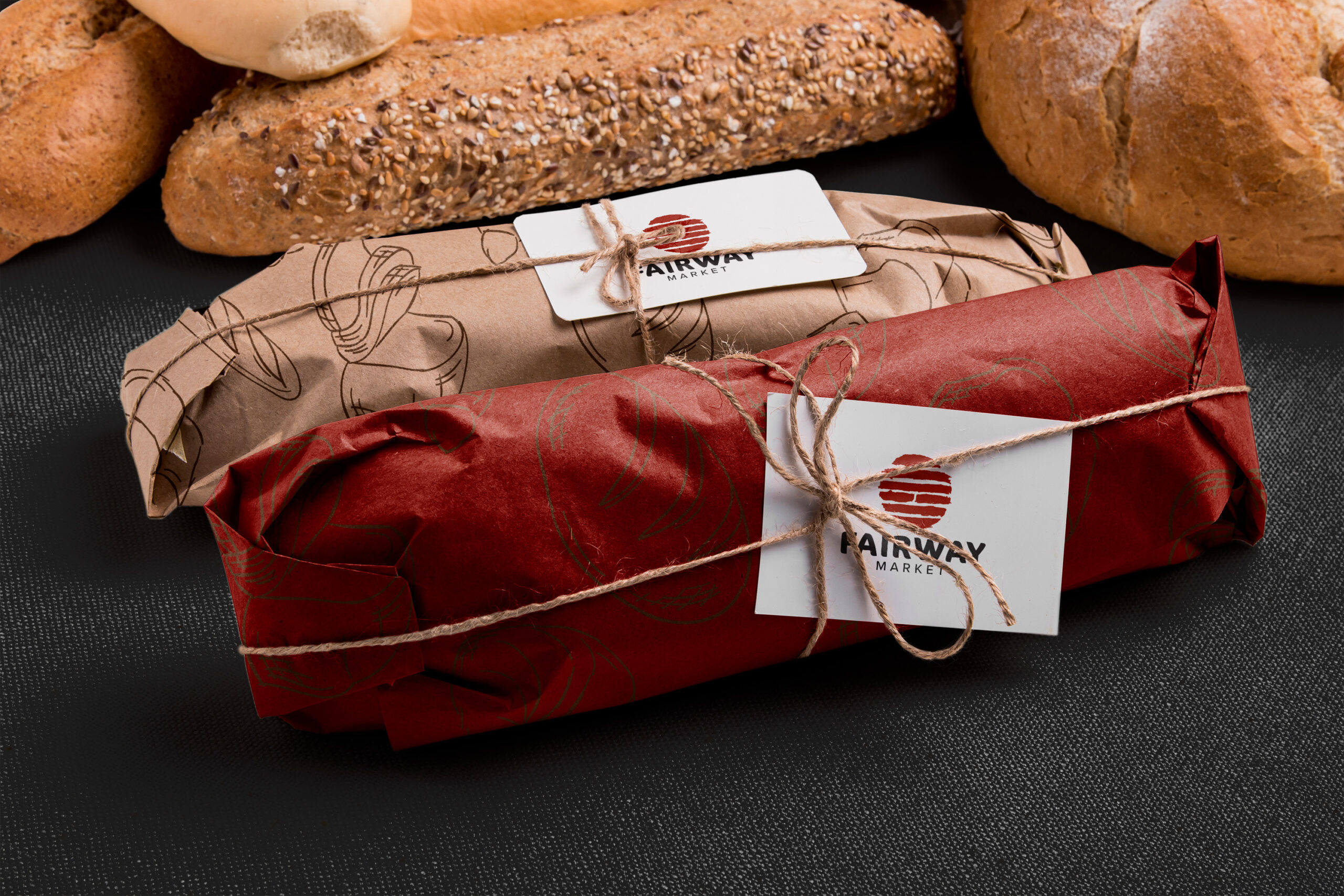
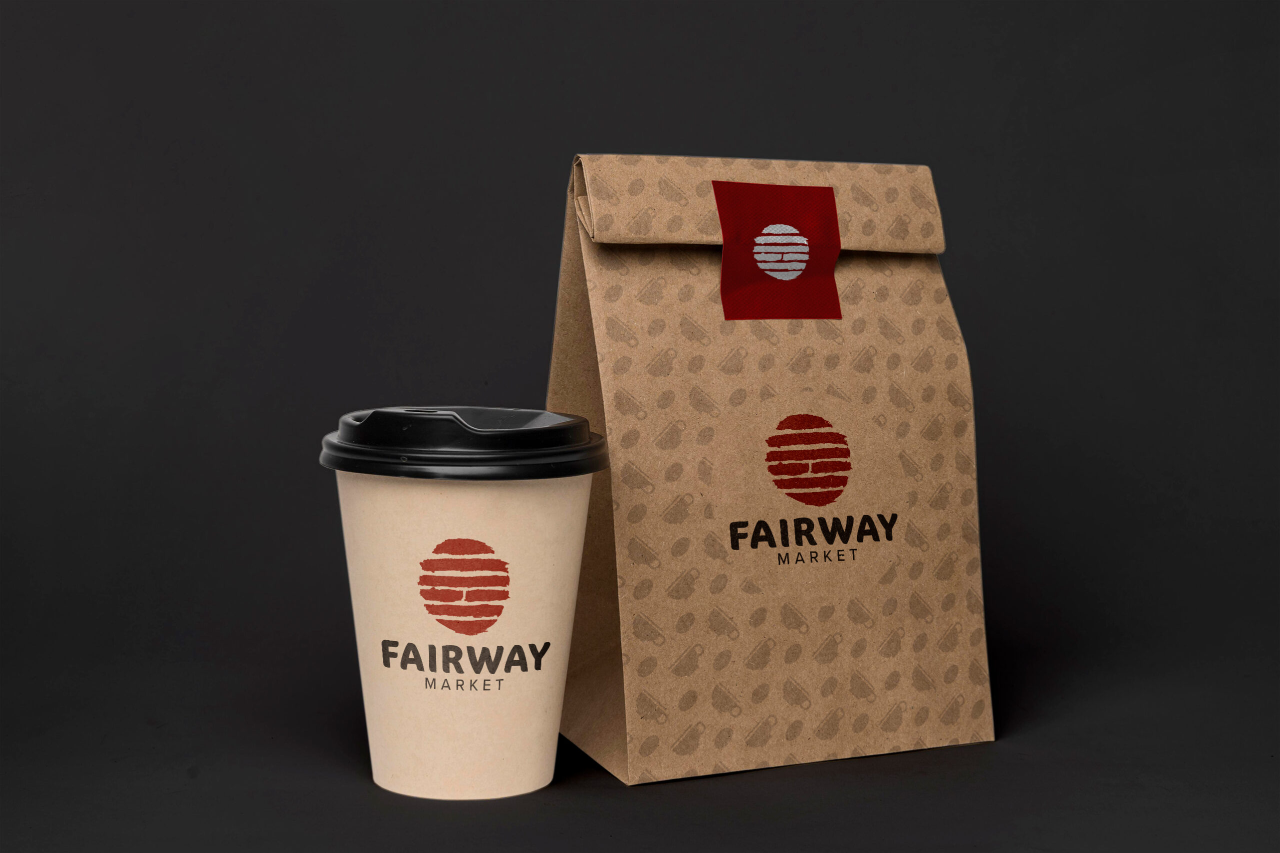
The new logo gets inspired by the Chinese’s ancient divination text, it stands for Family. Furthermore, the wordmark was created by hand and retains the texture to maintain the organic sense as well as the spirit of embracing the Asian culture of the brand. In addition, the predominant colours will be red, black, and white, which in Asian culture represent good fortune and joy.
Embrace Asian Culture
Let’s brew something bold—coffee’s on meっ♨
@2025
Read.cv